


Why Color Calibration Matters and How to Correct It In Your Pictures
When you take a great photo, but it looks dull or off when viewed somewhere else, it's usually a color issue. That's where color calibration steps in. It lines up what you see on screen with what's actually in the image file. If you're editing, sharing, or printing photos, getting the colors right can save a lot of frustration later. It's not complicated; however, you have to do this correctly. Let's figure this out together!
Part 1. What Is Color Calibration and Why Does It Matter?
Let's start by understanding what color calibration really means and why your image might not always match what you saw in real life.

Monitors and Perception Aren't the Same
If you have two devices with two different displays, and you view the same photo in each of them, they might show up totally differently. On one screen, the photo may lean towards blue, and on the other, towards yellow. And it's not just about brightness either.
Every display handles color in its own way, depending on the screen panel, the default settings, and even the lighting in your room. For example, if sunlight is hitting your desk, it can change how the image looks on your monitor. So, when you're editing a photo on one screen, you might assume the colors are balanced. But once someone else opens that same photo on another screen, the colors might feel way off.
The Problem with Uncalibrated Images
Let's say you edit a portrait, and it looks perfect on your laptop. But then you upload it somewhere or send it to someone, and suddenly, the skin tone looks too red, or the shadows turn muddy. That's exactly what happens when an image isn't calibrated.
You might not notice the issue right away, but others will definitely see the difference. It becomes more noticeable if you're printing that image because colors that seemed fine on-screen might come out dull or weird in print.
So when an image hasn't been calibrated, you're not seeing the real version of your own work. That disconnect between screens is what messes up the entire color balance and makes your photos super weird.
Color Spaces and Accuracy
There are different color spaces like sRGB, Adobe RGB, and ProPhoto RGB. These decide how much color your image can show.
If you're editing for the web, sRGB is usually the safe bet because it's supported on almost every platform.
Adobe RGB gives you more room to play with color, but it only matters if you're printing or using pro-level gear. ProPhoto RGB has the widest range, but it's tricky to handle and not ideal unless you know exactly what you're doing.
If you switch between these color spaces mid-edit, your colors might shift and cause problems. So, before you start editing, choose the color space that fits your final output, and keep everything consistent from import to export.
Part 2. What are the Main Factors that Affects Color Balance in Photography?
Now, let's get into what throws off your photo's colors in the first place:
Lighting Conditions During Capture
The light around you when you take a photo can change everything. If you're shooting outdoors in the morning, the photo might pick up a cooler tone. Later in the day, that same spot can look warm and golden. Indoor lights also play a huge role. Fluorescent bulbs often give off a greenish tint, while tungsten bulbs lean toward orange.
These shifts affect how your camera sees the colors in your scene. A nearby window can also reflect light in a way that throws things off. So if your photo looks too warm, too cool, or just weird in certain spots, there's a good chance the lighting at the time of capture had a hand in it.
Camera Settings and White Balance
Most cameras let you choose between auto white balance and manual settings, and both can cause problems. Auto white balance can make quick guesses that sometimes miss the mark. For example, it might try to "correct" a sunset and take all the warmth out of it. On the other hand, if you manually set the white balance for indoor light and then step outside, your next photo could end up looking way off.
Also, different camera brands handle white balance differently, which adds another layer of inconsistency. If the photo has strange tones, or the whites look slightly blue or yellow, chances are the white balance setting didn't match the lighting conditions when the photo was taken.
Post-Processing Mistakes
Once the photo is on your computer, the editing stage can either fix the color or mess it up a bit more. When you try to crank up the contrast, oversaturate certain tones, or use extreme filters, this can take the image far from what it originally looked like.
Sometimes, people go too far trying to make a photo pop, and the result ends up looking unnatural. Another common issue is using random tone curves or preset filters that don't suit the photo. Small tweaks to hue and temperature, too, can have a big impact if you're not careful. So, if the final version doesn't feel true to the scene you shot, the edits may be pushing the colors in the wrong direction.
Part 3. How to Check If an Image Needs Color Calibration
Here's how you can spot when your photo is off and what to look for:
1. Compare Across Screens
One of the easiest ways to check your image is just to open it on more than one screen. Open it up on your phone, your laptop, or a tablet, and see if anything feels off. You might notice the colors shift, or the image seems more washed out or more intense, depending on the device.
It's not about guessing which screen is right but about spotting the differences. If the same photo gives off a different mood or tone on different devices, that's usually a sign that something's wrong with the color calibration. Once you catch it early, you can start figuring out whether it's the screen that's off or the photo itself that needs correction.
2. Use Reference Images
Quite often, it helps to keep a neutral, well-edited reference photo nearby-something you already know has accurate color. You can place it side-by-side with the one you're working on and compare them directly. This trick works especially well with skin tones or product shots where colors really matter. If the reference looks clean and the one you're editing looks flat, dull, or overly tinted, you'll know it needs correction.
If you're not color grading professionally, having a benchmark helps your eyes stay objective. Our brains get used to color quickly, so without a reference, you might not notice things have drifted off until it's too late in the editing process.
3. Histogram and Clipping Alerts
Your editing software probably shows a histogram by default, but most people ignore it. That graph tells you how the tones in your photo are spread out-from deep shadows to bright highlights. If the peaks are bunched up on one side or completely missing from another, it's a red flag.
You can also turn on clipping alerts in most tools, which highlight areas that are too dark or too bright to show detail. These tools aren't flashy, but they give you hard facts about your image instead of just trusting your eyes. Once you know where the issues are, you can make targeted corrections instead of blindly adjusting exposure or contrast.
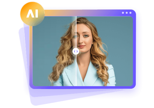
Part 4. Do Color Calibration Quickly Using HitPaw FotorPea
If you're not that tech-savvy and want to quickly calibrate the colors in your images, HitPaw FotorPea simplifies the entire process for you. Here's how you do it.


Step 1. Upload an Image in the Image Upscale Section
Download and open HitPaw FotorPea and go straight to the Image Upscale section.
That's the area where all the enhancement tools live, including color calibration. Click Image Upsale to upload your file in the editor. Once the image loads, you see the enhancement settings lined up under the preview. You don't need to adjust anything manually at this stage. Just make sure the image is fully uploaded and visible in the window.
This step gets your photo ready for editing and sets the stage for all the features you're about to use in the next step.
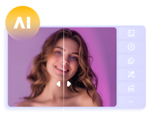
Step 2. Toggle on Color Calibration
Next, go to the bottom-right menu, toggle on Color Calibration, and click "Apply Current Settings to All" to automatically adjust the tones and correct the overall color balance in your image.
Once calibration is on, pick an enhancement model based on what your photo needs. You can use Denoise to remove grain, Brightness to fix dark areas, Sharpness to improve details, or Face to clear up facial features. Each model handles a specific fix. You just select one, and it works alongside the calibration to bring out better color and clarity in the image.
Step 3. Export the Image with All Enhancements Applied
Now, the final step is to save your edits. To do this, click "Export" and wait for the processing to end for the color calibration, adjust the export settings, and click "Export" again.
After export, the final image reflects all the corrections and is ready to use wherever you need it.
Part 5. What to Do After Color Calibration?
Once your image is calibrated, a few habits can help you avoid repeating color issues across projects.
Even if you fix the color in your photos, you still need to view them on a screen that shows those changes correctly. A monitor that isn't calibrated can throw you off and make you edit things that don't need fixing. Some monitors run too warm or too cool by default, and that messes with your edits.
You can use the built-in calibration tools of your device or a colorimeter to get your screen back on track.
It doesn't need to be a daily routine, but checking it every few weeks keeps your colors corrected. That way, what you see on-screen actually matches what's in the image file, whether you're editing, sharing, or printing the final result.
Once you have done the color calibration, don't just save it in any format and call it a day. The color profile you export affects how the image shows up elsewhere. Some people skip this part and wonder why their photo looks weird when posted or printed. Matching the color profile to the final destination keeps your photo consistent from screen to screen or from screen to paper. It's a small step, but it makes a big difference in how your work shows up later.
Part 6. FAQs of Color Calibration
Q1. What does color calibration mean?
A1. Color calibration means adjusting your image so the colors stay accurate across different screens or prints. It helps your photo look the way it's supposed to everywhere.
Q2. How do I fix color calibration?
A2. To calibrate the colors in your captured picture, upload it to the HitPaw FotorPea software, toggle on Color Calibration, select to apply it, and then export your project.
Conclusion on Color Calibration
Now you know how color calibration affects the final look of your photos. It's not just about edits. It also keeps your colors consistent across different screens and formats. Uneven light, poor white balance, and uncalibrated displays can all throw your image off.
HitPaw FotorPea handles the color correction process with just a few simple steps. Once you understand what causes the issue and how to correct it, you stay in control of the final result. You can save your image, upload it online, or send it for print with confidence that the colors will appear as intended.
 HitPaw Univd (Video Converter)
 HitPaw VoicePea
  HitPaw VikPea (Video Enhancer)


Share this article:
Select the product rating:
Daniel Walker
Editor-in-Chief
This post was written by Editor Daniel Walker whose passion lies in bridging the gap between cutting-edge technology and everyday creativity. The content he created inspires the audience to embrace digital tools confidently.
View all ArticlesLeave a Comment
Create your review for HitPaw articles