


What Are Split Complementary Colors and How to Use Them
Color Theory is a vital element in visual communication that helps designers produce emotionally resonant compositions. One often underrated and powerful color scheme is the split complementary color palette, which is a technique that tends to blend harmony with contrast.
Regardless of whether you're a fashion stylist, graphic designer, or interior decorator, understanding the credentials of the Split componentry colors is bound to elevate the creative work. Tune in to the post to learn everything about the split complementary color scheme.
Part 1. What Are Split Complementary Colors?
A split complementary color scheme relies on the three colors, including the base and two adjacent colors to its direct complement of the color wheel. This setup offers a high contrast look like complementary colors, but with more or less tension and subtlety.

Example: If you select the blue as the base colors, its complement is Organge. The split complementary colors might be red, orange, and yellow. When combined, they frequently create a palette that is both colorful and visually appealing.
How It’s derived from the color wheel?Driving from the color wheel is fairly simple, as you'll only need to start with a base color and find its direct complement. Then, you'll need to choose the two colors on either side of the component, including the red, orange, and yellow.
Visual Representation suggestionYou could also insert the simple labeled color wheel graphic showing in the base color ( blue) two adjacent hues like red, orange and yellow, and opposite (orange) connected on a triangle.
Part 2. Split Complementary vs. Complementary Colors
1. Complementary Color Scheme
It produces the two hues, such as orange and blue, which are the colors that are directly opposite each other on the color wheel.
2. Split Complementary Scheme
It provides one foundation, two near opposites, and the three colors.
Key Differences in Contrast and Harmony
| Feature | Complementary | Split Complementary |
|---|---|---|
| Number of colors | 2 | 3 |
| Visual contrast | Strong and bold | Moderate, with softer tension |
| Harmony | High, but can feel harsh | More nuanced and adaptable |
Pros and Cons
| Scheme | Pros | Cons |
|---|---|---|
| Complementary | High visual impact, clear contrast | Can feel aggressive or jarring if overused |
| Split Complementary | Balanced contrast, flexible | Slightly more complex to balance visually |
When to use Which
You could use the complementary when you require a bold contrast, like a call-to-action button. You could also use the split complementary when you require harmony and diversity.
Part 3. How to Use Split Complementary Colors in Design
1. Graphic Design
Split Complementary palettes are efficient for cohesion in posters and balancing the contrast, infographics, and illustrations. For instance, a base blue background with red, orange elements, and yellow might draw attention without overwhelming.
2. Web Design & UI
In UI design, a split complementary scheme provides visual clarity while preserving user friendliness. You may also use the base green for main elements, with the orange red, and purple red for CTAs and accents
3. Fashion
Stylists tend to use the split complementary pallettes to produce the dynamic yet coordinated outfits. A red blouse with teal and green yellow accessories produces an eye-catching ensemble without clashing.
4. Interior Design
Interior designers tend to use these colors schemes for flair and balance. A room with violet walls could also include the yellow-green pillows and yellow-orange accents for energy and depth.
5. Marketing & Branding
Split complementary color helps the brands stand out while staying approachable. A brand using the navy with the mustard and coral highlights could also appear both creative and professional.
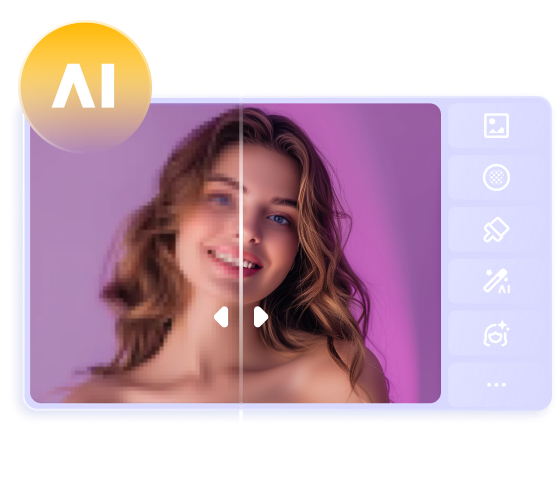
Part 4. The Best Tool to Balance Image Color with HitPaw FotorPea
Imagine having a picture with no balance, as this scenario could make your images look irrelevant and not worth admiring. In HitPaw FotorPea, you've found the best way to balance the color of the images without affecting the overall image.
The advantage you carry with HitPaw FotorPea is that it allows you to explore the 9 majestic AI models to elevate the overall quality of the Images.
The interface of this AI-powered enhancing tool is such that even newcomers won't find any difficulty enhancing or upscaling the quality of the images significantly.
Beyond that, HitPaw FotorPea also supports batch enhancing, which makes it look simple to balance the color of multiple images simultaneously. Apart from exploring the upscale that enables you to balance the colors of the images, you can also explore other AI models to make the black and white images look colored, eliminate the noise from pictures, and add the mind blowing filters to the images.
Features
- Lets you balance the color of the images quickly
- Works on Mac and Windows
- Explore the 9 outstanding AI models
- No image quality loss detected
- Enables you to balance the colors of multiple photos simulataneosly
- Adjust the background of the images
- Remove the unwanted objects from pictures
- Allows you to crop the images significantly


How to balance the colors with HitPaw FotorPea?
Step 1: Enter the HitPaw FotorPea's official timeline and install the software on the computer. Tap on the AI Enhancer while starting the tool, and then select the Enhance Photos Now to import the photo you wish to balance the color of.
Since it is compatible with batch enhancing, you'll be able to improve the quality of multiple photos simultaneously, and it also lets you to import the images in multiple formats.
Step 2: Now, you can see the 9 AI models on the screen, and all you need to do is select the Upscale Model to start balancing the colors of the images. If you want to apply some more AI models at once, HitPaw FotorPea also enables you to apply the various AI models at the same time.
Step 3: In this stage, you're required to tap on the Preview icon to apply the changes you've made to the images and then select the Export icon to download the images into the favorite folder on your computer.
Part 5. FAQs of Split Complementary Colors
Q1. Why do artists use split complementary colors?
A1. Artists tend to use the split complementary color schemes to strike a balance between harmony and contrast. This approach tends to add the visual interest without the harsh clash that full complementary pairs could sometimes create. It is perfect for highlighting the focal points while maintaining the overall units in a composition.
Q2. What is the split complementary color of green?
A2. Green's direct component is red, and its split complementary colors are red, orange and Violet. Using the green with these two hues from the well balanced, dynamic trio, which is suitable for everything from design layouts to fashion palettes.
Final Words
Knowing about the split complementary colors could give you a creative edge regardless of whether you're decorating a room, designing a brand, or crafting a user-friendly website. This color scheme offers the right amount of contrast without losing harmony, making it brilliant for designers and many artists. If you want to balance the color of the images, HitPaw FotorPea is recommended as it provides the 9 majestic AI models to select from.
 HitPaw VoicePea
  HitPaw VikPea (Video Enhancer)
 HitPaw Univd (Video Converter)


Share this article:
Select the product rating:
Daniel Walker
Editor-in-Chief
This post was written by Editor Daniel Walker whose passion lies in bridging the gap between cutting-edge technology and everyday creativity. The content he created inspires the audience to embrace digital tools confidently.
View all ArticlesLeave a Comment
Create your review for HitPaw articles