What is the Colour Wheel in Photography? Understanding the Basics
A photographer, while taking a photograph, sees the real moment, but viewers only see what's inside the frame captured. Basically, the colours in that picture depict the whole story; this is where Colour Wheel Photography becomes the guide, which helps you turn simple images into expressive visuals. In this article, we will explore how to apply colour wheel photography to normal images and its emotional impact.
Part 1. What Is a Colour Wheel in Photography
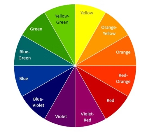
Color wheel in photography is the art of using a colour chart to understand and apply hues, which helps camera professionals to harmonize compositions. The colour wheel connects the science of light with the art of visual storytelling, transforming technical understanding into aesthetic beauty and emotional impact. This element in photography organizes pigments according to their spectral relationship, which displays primary, secondary, and tertiary colours, which we will study below:
Primary Colors (Red, Blue, Yellow)
- These are basic colors from which other hues are derived, and cannot be made from other shades.
- They give a striking contrast and clear visual emphasis to provide a dynamic appeal.
Secondary Colors (Green, Orange, Purple)
- They are created by combining two primary colours, adding variety and balance in the portrait background.
- A combination of red and blue makes purple; blue and yellow make green; red and yellow make orange.
Tertiary Colors
- Tertiary composition is made by blending primary colors with their neighboring secondary colors.
- These tones produce smooth color transitions and visually pleasing compositions.
Although the above information gives comprehensive knowledge on these colors, let’s have a quick comparison. The following table features a comparison of all these color types:
Aspects
RGB (Additive color model)
CMY (Subtractive color Model)
Full Form
Red, Green, Blue
Cyan, Magenta, Yellow
Color Creation Method
Additive colors are created by adding light
Colors are created by subtracting light
Primary Use In Photography
It is used in camera sensors and display screens
Used in printing , Photo printing
Color Wheel Type
It starts from black, adds light to reach white
Starting from white subtracts light to reach black
Color Wheel Appearance
Luminous hues for digital imaging
Muted pigments for print outputs
Part 2. Color Relationships on the Wheel
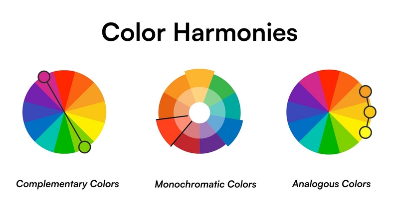
The relationship between shades helps you to manage the interaction of color with the frame. The photo color wheel is not only a tool, but it is a guide that helps to evoke emotion and visual harmony. There are four main types of colour wheel photo relationships:
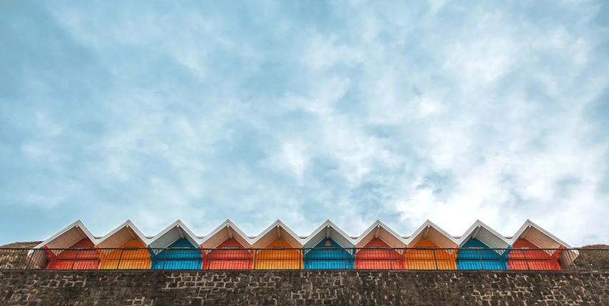
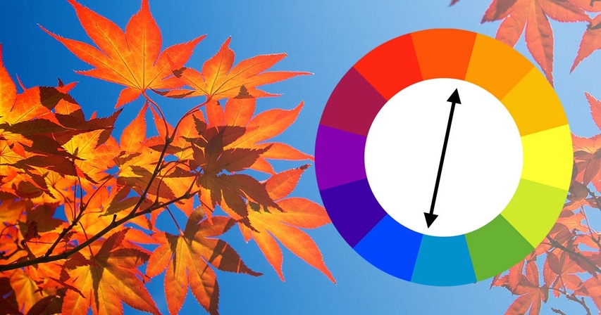
- 1. Complementary Colors:Positioning directly opposite to each other on the wheel, like blue and orange, creates strong visual tension, giving bold photography.
- 2. Triadic Colors:This scheme uses three hues around the wheel, like red, yellow, and blue, to harmoniously blend and create a cohesive image.
- 3. Monochromatic Images:This relationship relies on the variation of a single tint; using its tones produces subtle contrast and emotional depth for ideal photography.
- 4. Analogous Colors:These patterns sit adjacent to each other on a photo of a color wheel, such as blue-green, creating playful or energetic compositions.
Part 3. Applying the Colour Wheel for Photography
Choosing the right pattern of color palette is one of the most crucial choices for an image creator. It determines how the viewer feels where the eye travels, using a color wheel that creates harmony and contrast within each frame. The following section will help you apply the right color wheel:
Balancing Subject and Background Color
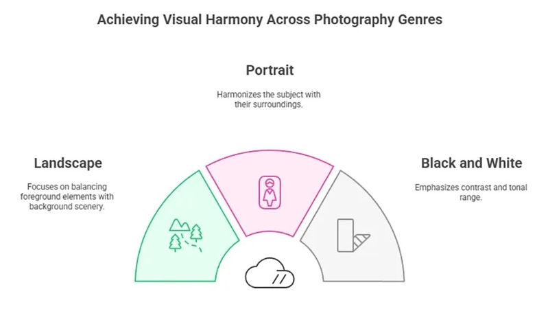
- The relationship between background and color is the key factor to visual storytelling.
- Contrast works best by choosing brightly colored subjects against a muted background, making it noticeable.
Using Complementary Colors
- They create dynamic contrast, which is ideal for fashion streak and product photography, where bold statements enhance visual impact.
- These colors should be used thoughtfully; too much contrast can spoil the beauty of the image.
Applying Analogue Colours
- Analogous colors are patterns placed next to one another, creating smooth harmony and a calming effect.
Part 4. Emotional Impact of Color Wheel Photography
Pigment plays a compelling role in making the emotional impact of color wheel photography on the viewer. Each group of colors determines various feelings and responses to guide mood and atmosphere. Follow this guide for comprehensive knowledge of the emotional impact of the color wheel photo:
1. Warm Colors (Red, Orange, Yellow)
As the name shows, warm colors like red, orange, and yellow give a sense of energy and warmth to a viewer. These hues convey passion and excitement to an observer, creating a sense of closeness and liveliness.
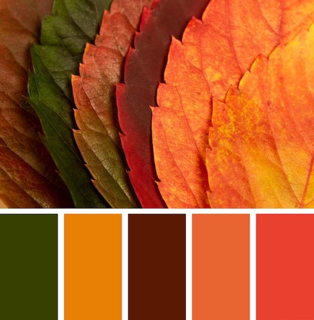
Photography Context: Often used in portraits, sunsets, and vibrant street photography
Practical Tip: Use golden hour lighting or colored filters to enhance warmth. Red clothing or orange props can make subjects pop and convey emotion.
2. Cool Colors (Blue, Green, Purple)
Cool colors evoke a sense of calm, relaxation, peace, and balance. These tones recede in composition, creating a depth and soothing visual experience.
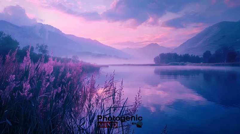
Photography Context: Common in landscapes, seascapes, and minimalist compositions.
Practical Tips: Shoot near water or foliage for natural cool tones. Blue hour (pre-dawn/dusk) enhances serenity in cityscapes or landscapes.
3. Neutral Tones (Black, White, Gray, Beige)
Neutral tones are muted shades that lack a lot of intensity and act as a balancing tone. They bring sophistication and simplicity, allowing the main subject to stand out naturally. They stabilize mood, balance compositions, and emphasize shapes and textures.

Photography Context: This color wheel photo is important to select fitting hues that complement the subject and background without any clashing. Adjusting the tones and contrast makes an ideal image for its purpose.
Practical Tips: To have customized results, the user can apply neutral backgrounds to highlight subjects. Combine with selective color accents to draw attention.
Part 5. Perfecting Colour Wheel Photo With HitPaw FotorPea
Given the significance of the right choice of colors in a photograph, we must use a balanced photo of colour wheel for maximum impact. In case your picture lacks the color harmony, use HitPaw FotorPea (formerly HitPaw Photo Enhancer). This tool is a high-quality image enhancement software that colorizes pictures as well. If your image is short of colors, this platform will automatically turn on the AI Colorize model to prevent manual toggles.
Key Features
- 1.Helps you transform old pictures by adding colors using the Old Photo Restoration feature.
- 2.Changes the aspect ratio of the colored image and enlarges it for enhanced quality.
- 3.Offers image samples for testing the software to know about colorizing photos.
- 4.Enables Face Restoration to preserve the skin tone and texture and add natural colors.
- 5.Allows image denoising for pictures that have grains.
Step-By-Step Guide to Perfecting Color Photo in HitPaw FotorPea
The following steps are about colorizing pictures with HitPaw FotorPea:
Step 1. Open the Image Enhancer on HitPaw FotorPea
To start the process, click the "Enhance Photos Now" button, and you will reach the next window.

Step 2. Select and Import Images for Colorization
In the next window, drag and drop the images for colorization.

Step 3. Preview Picture After Colorization
Later, turn on the "Low-Light Enhancement" model in the right section. When the colorized image is generated, select the "Preview" button to see it.

Step 4. Select Export to Save Image
At last, select the "Export 1 Image" option to download the results on your PC.

Part 6. FAQs on the Colour Wheel for Photography
Colour wheel photography is important for photographers, as it helps them choose colors and contrasts in their images. This can guide their emotional tones by showing how different hues interact visually.
The color wheel is used in photo editing to help enhance contrast and balance to create a mood. This will ensure colors that complement each other for a polished final image.
RGB is used for digital photography, where colors are formed by a combination of light on screens. Whereas CMYK is used for printing by layering ink pigments on paper.
Conclusion
In conclusion, this article looks into detail regarding color wheel photography and its emotional and psychological effects. We also explained how to generate customized images using HitPaw FotorPea for personalized results. This article also looked into key features of this tool as an effective option for creating professional images.
Leave a Comment
Create your review for HitPaw articles


