Room Colour Combination: 13 Stylish Home Colour Pairs
The right colour on your interiors can change your life and the ambience of your living place. The room colour combination depends on multiple factors like the mood you want to create, furniture style, and the lighting of your room. Hence, selecting the right pair of colours from a range of styles and shades may be overwhelming for many.
Therefore, this article covers the top 13 inspiring colour pairings explained for you to decide which combination will suit your space. You will also be introduced to an AI tool if you seek to visualize your chosen palette before making any changes.
Part 1. Top 13 House Colour Combination Ideas for Stylish Interiors
First off, let’s explore 13 of the best color combinations for your house that bring style, character, and a fresh look to every room:
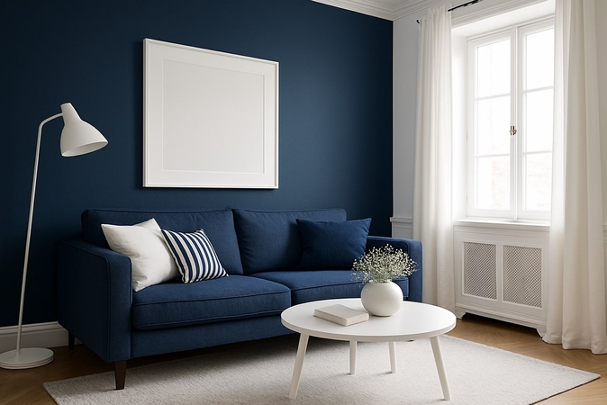
1. Navy Blue and Crisp White
Navy blue paired with crisp white colour brings up the elegance and a sense of sobriety to interiors. This pairing feels sophisticated, calm, and orderly in spaces like the bedroom and living areas. It is a perfect combination for individuals who want to live in a spacious space because a white touch makes the space feel capacious compared to darker tones.
2. Sage Green and Soft Cream
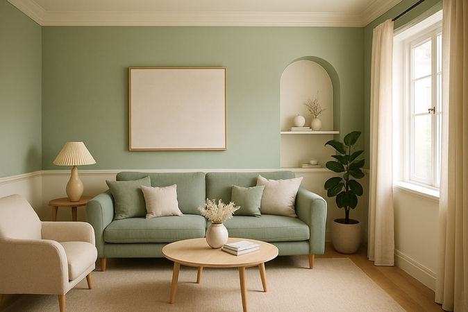
In this colour combo, the sage green colour gives a calm and natural tone, while soft cream adds a warm tone to your living space. These colours together make you feel relaxed and create an elegant look, which is perfect for your bedrooms and study rooms. This soft and simple colour mix makes any space feel peaceful, cozy, and welcoming.
3. Teal and Grey
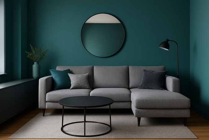
These tones together make an ambiance that is energetic but still feels elegant, ideal for contemporary homes. This is one of the great colour schemes that keeps the room looking modern and mature because of the different stories behind both colours. Teal injects energy and distinguished vibrance, while on the other hand, grey anchors the palette, which is perfect for living rooms and offices.
4. Dusty Blue and White
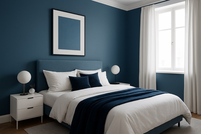
Dusty blue colour gives a calm and gentle feel, while white gives a touch of fresh and clean atmosphere that brightens any room. This blend turns any space into a peaceful escape that helps you feel at ease without losing a sense of style. The colour mix suits best in bedrooms and lounges due to its comfort and elegant look.
5. Pink and Muted Green
This combination of colours produces a light contrast, which makes the room look homely and light-hearted. The best colour to go with pink is Muted Green, which adds a warm tone but a soft feeling, and pink gives a natural feel. It gives a proper proportion of strength and tranquility in a contemporary manner, which can fit serene bedrooms.
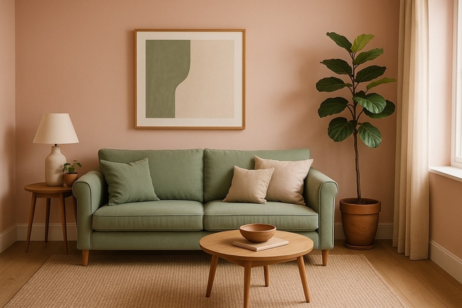
6. Burnt Orange and Neutral Tan
If you love warm and vibrant tones for your space, then trying burnt orange with a neutral tan is the recommended mix for you to choose. Tan colour takes advantage of orange to ground your room and make it feel exciting with comfort. Burnt orange with tan is found in nature, which keeps a reminder of the natural world in your space.
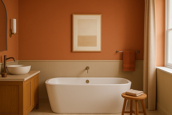
7. Maroon and Gold
A colour combination that is specifically used for luxurious spaces like entrances, guest houses, and restaurants. It creates a mature atmosphere that feels very expensive, but is still easy to live in. The specialty of gold colour is to give a rich look to the interiors, not recommended for those looking for a too mature vibe in spaces.
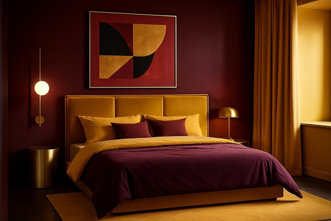
8. Gray, Yellow, and White
The combination of three colours that look good together is a wonderful choice for kitchens and workspaces. This trio makes the spaces feel sunny and settled, suitable for summer and spring seasons. It is preferred for rooms facing the direct sun to be made to look warmer, fresher, and more spacious.
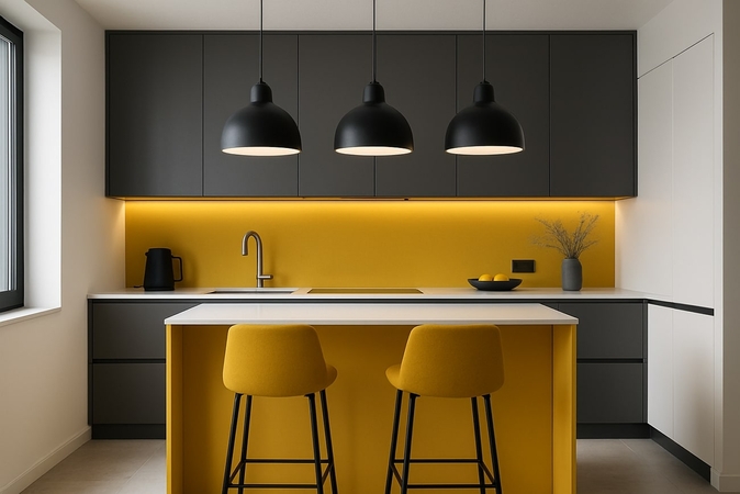
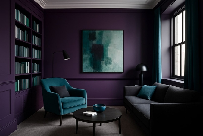
9. Purple, Teal, and Gray
It is a mix that is quite adventurous and wonderful in a place where one would like inspiration, and a relaxing place, such as a reading corner or a studio. This combination is suitable for gaming rooms to provide a fun and relaxing look. Here, purple acts like a dash of mystery, teal brightens without overwhelming, and gray is the glue that makes all colors stick together.
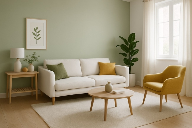
10. Olive Green, White, and Mustard
If you’re looking for a sober colour combination for a space that feels rooted and cheerful, then this colour palette is one of the great house color combinations. Here, the olive is earthy, the white is a clean background, and the mustard is a shocking surprise with its warm punch. This is an ideal combination of colours to use in a bedroom because it is reminiscent of the sun's rays through the leaves.
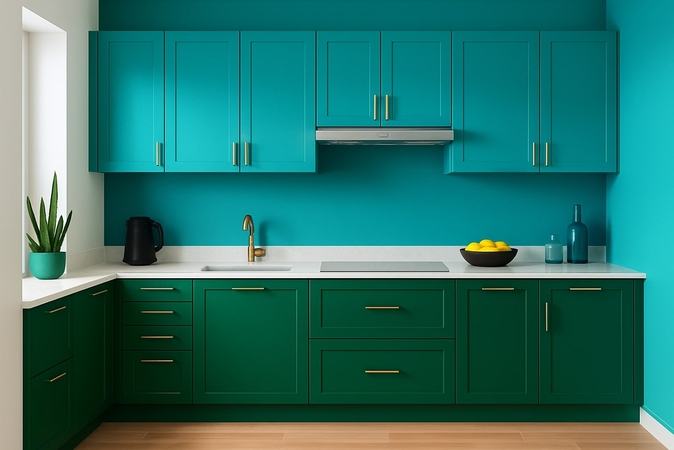
11. Emerald Green and Turquoise Blue
This is the combination to get when you prefer unusual decisions and are eager to have a room with character and fashion. The emerald provides a luxurious appearance, and the turquoise color gives a fun touch due to its vibrant tone. Emerald green and turquoise blue scheme provides an assertive appearance that will be visible in any type of living room.
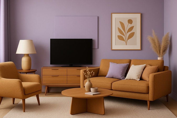
12. Lavender and Camel
The lavender gives the room a cool sensation that helps relax you after a hectic day. The camel's golden color gives an effect of comfort and earthiness. The best color combinations for the home make a pleasant environment that will be effective in silent areas such as reading corners or bedrooms.
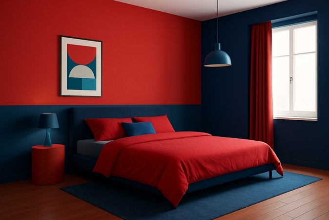
13. Red and Blue (Split Complementary)
The red color is very energetic and attracts your attention immediately; the blue one is used to balance it out. Rather than being contrasting, these colours complement each other in a split complementary technique that allows each of them to stand out. This combination suits better in the rooms where you desire to have both excitement and balance, such as creative design studios or vibrant family rooms.
Part 2. Tips to Keep in Mind Before Decorating Your Room
Having discussed the awesome colour combinations with different ambiance and natures. It is important to keep some tips in mind before decorating your room:
- 1. Decide Style Before Shopping: Before buying the things you’ll use in decoration, you must decide the style of room you are aiming for. Think about the environment you like the most, such as traditional or minimalist.
- 2. Select a Decent Color Palette: Once the style is decided, think about the color combinations of two or three that you like the most. Have your room painted or papered with that combo or add a few lights that match your favorite color scheme.
- 3. Plan the Furniture: Virtually place your main bed or sofas in a decent structure through apps and see how much extra space is left in the room. Try to maintain a good structure that makes the room more spacious and airier.
- 4. Go For Ornaments: Buy ornaments to convert your dull space into a stylish and inviting setting. Extra elements like lamps, paintings, and chandeliers could help elevate your interior decor.
- 5. Consider Adding Personal Touch: Plan to personalize the space with photos, plants, or characters you like that will make your room special and welcoming just for you. For instance, anime lovers often use anime character models to display them in their room to make it a happy place to live.
Part 3. Bring Your Colours to Life with AI: HitPaw FotorPea AI Generator
When designing your room, you might not know which interior design colour palette will look best. Here is what technology comes in and AI helps you preview and perfect your room colour combinations in minutes. However, if you are going to decide on a colour combination for your interior, we recommend using the HitPaw FotorPea (formerly HitPaw Photo Enhancer) AI generator that can help predict different colour combinations.
Key Features
- 1. Generates AI-images with multiple sizes by adding text form prompts.
- 2. Supports batch processing for quick edits across multiple pictures at once.
- 3. Offers various AI models to enhance, color calibrate, upscale images up to 8K, and more.
- 4. Repair scratched and damaged photos for a clean and professional look.
- 5. Removes background from object-oriented images in a single click.
Guide to Generating Room Color Combinations With FotorPea
Now that we have explored different combinations of colors that look best together, follow these simple steps to create images for room colour combinations with FotorPea.
Step 1. Launch HitPaw FotorPea and Choose AI GeneratorOpen HitPaw FotorPea and select the “AI Generator” tool to enter the next page.

Step 2. Select Text-to-Image Mode and Enter The Prompt
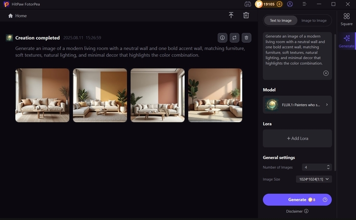
In the next interface, select the “Text to Image” mode and enter a detailed prompt for the room color combinations image generation. Next, choose the desired model by hitting the “Model” button, and choose the number of images and size from the “General Settings” button before pressing the “Generate” button.

Step 3. Export The Generated Image From FotorPea
After your image is generated, tap the “Magnifier” icon to see the final result closely. Once you have previewed the image, click the “Download” button to export it.
Part 4. FAQs on Living Room Best Color Pair
The trending and best color schemes for rooms in 2025 are earthy brown hues with pink undertones, indigo and white, and bright colour combinations such as brown and cream.
A good accent colour pairing offers contrast or hues, think warm main shades with cool accents like yellow with blue, or using the colour wheel for balanced results.
Physical samples give true textures and colors, but require more time and effort, whereas tools like HitPaw FotorPea are faster and help you instantly preview ideas.
Yes, you can mix more than two colours successfully. Simply follow the 60-30-10 rule of main and secondary, with accent colours to create a beautiful design.
Conclusion
To sum up, selecting your favorite colour combination for your room can completely redefine your space and align with your style, nature, and personality. This article has outlined 13 of the coolest color combinations, along with their designs. If you would like to visualize these combinations before taking a step, use HitPaw FotorPea to generate AI-improved images that help you experiment with multiple colour palettes.
Leave a Comment
Create your review for HitPaw articles


