How to Shade Pixel Art Like a Pro: Step by Step
A beginner artist opens their drawing program, creates a small shape, and quickly realizes something is missing. The art feels flat, lifeless, and without depth, colors, and shading. This is where pixel art shading becomes essential.
Shading isn't just an optional extra; it's the backbone of making pixel art look polished and expressive. In this article, you will learn everything about pixel art shading, from understanding light and color to mastering different shading styles.
Part 1. What Is Pixel Art Shading and Why Does It Matter
Pixel art shading style is the process of placing individual pixels of light and shadow to create depth and form. Because pixel art relies on minimal details, shading becomes the primary tool for turning flat shapes into believable objects. Without shading, even well-drawn sprites can look unfinished or amateurish.
Role of Pixel Art Shading
- Shading helps separate foreground and background elements, making objects look closer or farther away instead of flat and lifeless.
- Darker shading creates tension or mystery, while brighter shading can make a scene feel cheerful, energetic, or soft.
- Light and shadow guide the viewer's eye to the most important parts of the sprite or scene.
- Cohesive shading across all assets makes the art style feel polished and professional, ideal for games and animations.
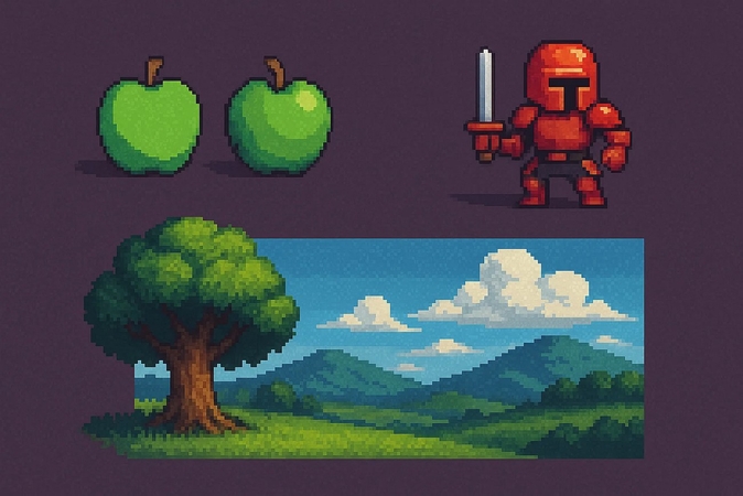
Shading is one of the clearest factors that separates professional pixel art from beginner work. Beginners often rely on flat colors or inconsistent light sources, which makes their sprites look dull or unfinished. Professionals, however, use controlled highlights, clean shadow placement, and limited palettes to create depth and clarity. This attention to lighting makes each pixel feel intentional. As a result, even simple sprites appear polished, dimensional, and visually striking.
How to Shade Pixel Art
If you are wondering how to shade pixel art, it starts with choosing a clear light source, then placing darker pixels where light can't reach. Artists use midtones as the base, add shadows for depth, and apply highlights sparingly. Clean pixel placement and a limited palette keep the art readable and polished.
How to Color Pixel Art
Coloring pixel art starts with selecting a small, controlled palette that fits your theme. You can begin with midtones to block in the main shapes, then add lighter and darker variations for highlights and shadows. Keep colors cohesive by adjusting hue and saturation slightly between shades.
Part 2. Understanding Light and Shadow in Pixel Art Shading
Before placing a single pixel of shading, it helps to understand how light behaves. Light direction, intensity, and color all influence how objects appear. Below are the key ideas to guide your shading choices:
Light Direction Defines Shading Placement
The angle of the light source determines where highlights land and where shadows fall. A clear direction creates predictable and realistic pixel art shading.
Highlight, Midtone, and Shadow Pixels
Pixel art shading relies on a simple trio: bright pixels for highlights, medium tones for structure, and dark pixels for shadows. Balancing these three creates convincing depth.
Consistent Lighting Improves Realism
Using the same light direction across your entire sprite prevents visual confusion. Consistency helps the viewer instantly understand the shape, volume, and orientation of the object.
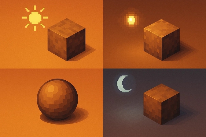
Different Sources Change Shading Intensity
Sunlight creates strong, crisp shadows, and moonlight casts cooler, muted tones. Adjust shadow sharpness and color temperature depending on the imagined light source.
Part 3. How to Shade Pixel Art: Guide for Beginners
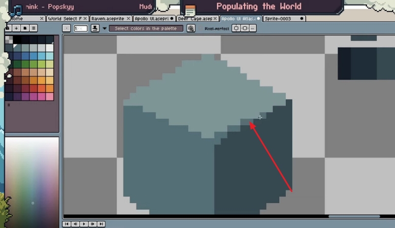
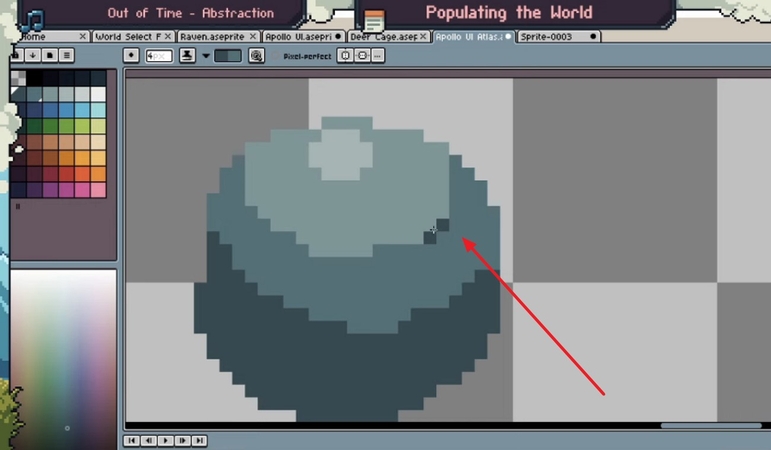
To shade your pixel art, you might need a handy tool like Aseprite. It is a powerful, pixel-art-focused editor and animation tool available on Windows, macOS, and Linux. This offers frame-by-frame animation with onion-skinning, palette management, pixel-perfect brushes, and tile map modes. To learn how to color a pixel art image with this tool, read the steps mentioned below:
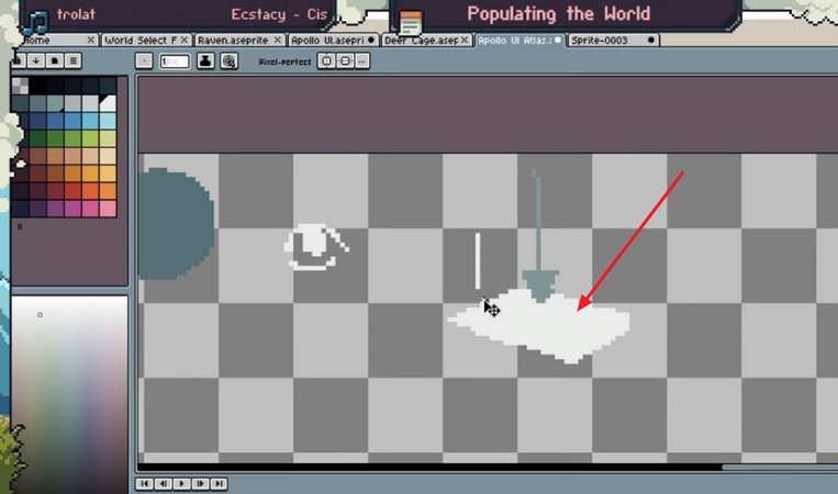
Step 1.To begin, decide where your light is coming from before you begin. This will determine where you place highlights and shadows and draw the shape.

Step 2.After creating your shape, access the color palette from the left and sketch your basic shapes using a midtone color. This creates a balanced foundation for shading.

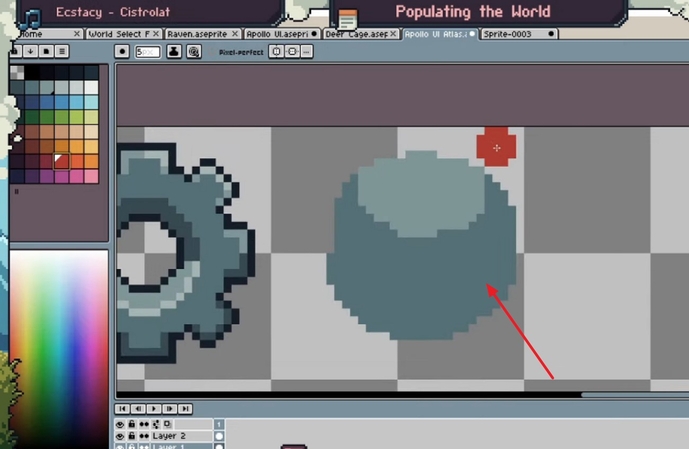
Step 3.Place darker pixels in the areas that face away from the light which helps define depth and volume.

Step 4.Add brighter pixels on edges and surfaces directly hit by the light source to create reflective details.

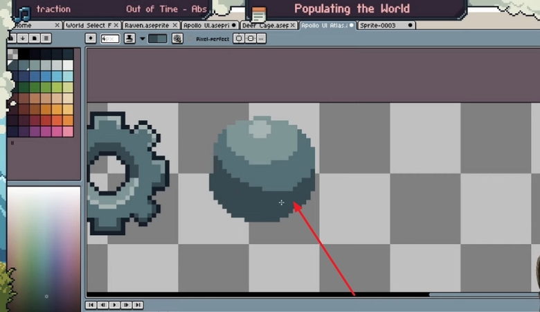
Step 5.Zoom in on the image to get a closer view and place each pixel accurately and maintain clean, crisp shading.

Part 4. Exploring Different Pixel Art Shading Styles
Whether you are designing games or creating illustrations, the pixel art shading styles you select directly impact readability, tone, and performance. Below is a detailed breakdown of the main shading styles and where each one works best:
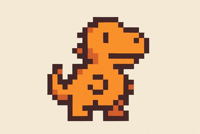
1. Flat Shading
Flat shading is the simplest pixel art shading style, using minimal gradients and one or two tones to define form. By keeping colors clean and contrasts subtle, this style emphasizes readability over depth. It works particularly well for small icons, UI elements, and low-resolution sprites where clarity is more important than realistic lighting.
2. Soft Shading
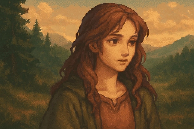
This technique relies on gradual transitions between tones, often using dithering techniques to blend colors smoothly. This approach gives sprites and backgrounds a more nuanced, painterly feel. It's ideal for RPGs, detailed character portraits, and atmospheric environments where mood and realism matter.
3. Cell Shading
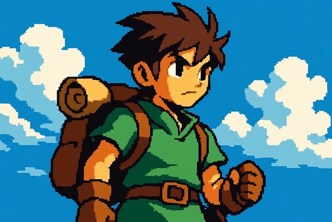
It creates sharp, bold contrasts between light and shadow without intermediate blending. This pixel art shading style produces a cartoon-like, high-impact visual effect that works well in platformers, action games, or stylized characters. The clean divisions between tones make objects readable even at small sizes.
4. Retro Shading
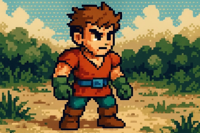
Retro shading mimics the aesthetic of 8-bit and 16-bit console games, using a limited palette and hard-edged shadows. It emphasizes simplicity, clarity, and nostalgia, perfect for indie developers or projects aiming to recreate classic game visuals. Despite its limitations, the retro pixel art shading style can be expressive, using carefully chosen contrasts to imply texture.
Part 5. Easy Pixel Art Shading Tips with HitPaw FotorPea
Imagine you've created a simple pixel character that feels flat and lifeless. Opening it in HitPaw FotorPea (formerly HitPaw Photo Enhancer) allows you to enhance its depth and lighting easily. You can add shadows, highlights, and color adjustments with pixel-level precision. With an AI-powered image generator, you can balance color and lighting, fix errors, and sharpen the details to transform your AI pixel image into a perfectly shaded pixel masterpiece.
Prominent Features
- 1.Conveniently generates images across the text prompt provided by the users.
- 2.Lets users select the AI generation model according to their preferences..
- 3.Offers the inspiration functionality to generate a text prompt automatically for image generation.
- 4.Provides a template library to give users ideas for their image generation process.
- 5.Eliminates unwanted grain and noise from the pictures automatically to give high-quality results.
Guide to Shading Pixel Art Images with FotorPea
After learning about this pixel art shading generator in detail, let us have a look at the step-by-step guide on how to use FotorPea's Image Generator:
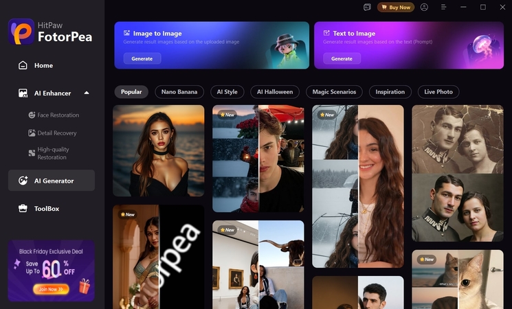
Step 1. Launch Tool and Choose Image Generator
Begin by launching FotorPea on your device and accessing its homepage. Next, locate the "AI Generator" tab within the homepage and click on the Image to Image option.
Step 2. Import Your Image and Give Prompt
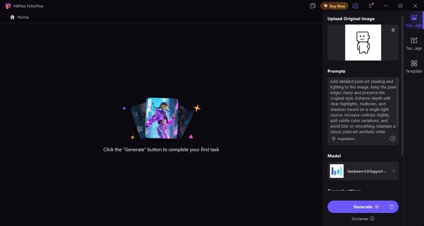
As you proceed to the next window, import your Pixel Art image that requires improvement. Next, give the prompt for enhancing the shading and lighting of the pixel art in the designated field. Choose the AI generation model and hit the "Generate" button to execute the process.
Step 3. Export the Shaded Pixel Image From FotorPea
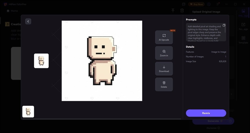
Once the image is shaded, a thumbnail of it will be generated in the following interface. To preview it in full screen, press the "Magnifier" icon, and to save the results, press the "Download" icon to successfully save it to your device.
FAQs on Pixel Art Shading
Small sprites typically look best with 3-5 shades per color in pixel art shading. A midtone, one highlight, and one or two shadow tones. Keeping the palette limited preserves clarity and prevents visual noise at low resolutions.
Yes, brightness and contrast settings can make highlights look blown out or shadows appear too dark. It's a good idea to check your pixel art on multiple screens or use color calibration tools to ensure consistency.
Yes, but results vary depending on the tool and how efficiently it preserves pixel edges. For beginners, HitPaw FotorPea offers a controlled way to enhance shading with AI without losing its quality.
Conclusion
To sum it up, this article provided a complete guide on how to shade and color pixel art using different techniques. However, if you want to add more depth in pixel art shading, using HitPaw FotorPea is the best choice. This AI-powered tool lets you add lighting and shading automatically to your pixel art images for more enhanced results.
Leave a Comment
Create your review for HitPaw articles


