


Neon Colors – A Complete Guide to Their Meaning, Uses, and Design Impact
Neon colors are bold, vibrant, and impossible to ignore. Whether you see them in fashion, design, or artwork, these electrifying hues create eye-catching visuals that stand out. In this guide, we explore what neon colors are, their impact on design and art, the best tools to customize neon images with HitPaw FotorPea, and expert tips for the perfect neon color combinations.
Part 1. What Are Neon Colors?
Neon colors are ultra-bright, highly saturated shades that appear to glow due to their high intensity. Unlike pastel or muted tones, neons have a luminous quality, often seen in signs, clothing, and digital art.
The Science Behind Neon Hues
Neon colors get their brilliance from high-luminance pigments. They reflect more light than standard colors, making them appear to glow. Originally, neon signs were created using noble gases like neon, argon, and krypton, which emit bright colors when electrified.
Why Neon Colors Stand Out
The human eye is naturally drawn to high-contrast and vibrant colors, making neon an excellent choice for attention-grabbing designs. Their intense brightness ensures visibility even in low-light conditions, making them popular in signage, fashion, and advertisements.
And Neon colors command attention because they push the limits of human visual perception. Their extreme saturation and high contrast against neutral backgrounds trigger strong responses in the brain. Studies show that neon yellow-green (#CCFF00) is the most visible color to the human eye, explaining its use in safety gear and traffic signs. In nature, such colors are rare, making them inherently unnatural and futuristic.

Part 2. Neon Colors in Design and Art
How Designers Use Neon for Bold Visual Statements
Graphic designers and artists use neon colors to create energetic, modern, and edgy aesthetics. From web design to product packaging, neon hues add vibrancy and dynamism to creative projects.
For example, neon’s intensity makes it ideal for projects that demand attention. In branding, companies like Monster Energy and PlayStation use neon to convey energy and innovation. In UI/UX design, neon accents guide users’ eyes to buttons or notifications. Meanwhile, interior designers employ neon lighting to create futuristic or retro atmospheres in spaces like nightclubs or themed cafes.
Best Practices for Incorporating Neon into Digital and Print Media
1. Use neon as an accent color rather than the main hue to avoid overwhelming the viewer.
2. Pair neon with dark or neutral tones to create strong contrast and readability.
3. Apply neon highlights in typography, buttons, or call-to-action elements for a high-impact effect.
Iconic Artworks and Trends Featuring Neon
Neon has a long history in pop culture and fine arts. Artists like Dan Flavin pioneered neon light sculptures, while contemporary street artists use neon tones to make bold statements. Neon trends are also seen in futuristic and cyberpunk aesthetics, where glowing colors create a digital-age ambiance.
While contemporary street artists use neon tones to make bold statements. Neon trends are also seen in futuristic and cyberpunk aesthetics, where glowing colors create a digital-age ambiance.
Part 3. The Best Tool to Customize Neon Colors Images with HitPaw FotorPea
Creating neon effects manually can be tricky. Balancing saturation, glow, and contrast requires precision—which is where HitPaw FotorPea shines. This user-friendly editor simplifies images design for both beginners and pros.
In a crowded market of design tools, HitPaw FotorPea distinguishes itself by prioritizing accessibility and precision for customizing neon images.
Key Features of HitPaw FotorPea
- AI-powered generating neon effects
- One-Click Enhancements to boost brightness and saturation for a neon pop
- Remove or replace backgrounds with neon-infused designs
- Fine-tune neon hues for the perfect look.
- No image quality was found while generating the images
Steps to Generate Neon Images
Step 1: After going into the timeline of the HitPaw FotorPea, you'll need to install the software and then launch the tool afterwards. Choose the AI generator icon and then select the Type What You Want to See button.
Step 2: Next, you'll need to enter the text description of what you wish to create and apart from typing in the text description. What’s more, you can also import the photo and then apply the outstanding image styles and templates to the images.
Step 3. Select the appropriate resolution and size of the images and then hit the Generate button. After the image generation, you'll need to preview the photos and then select the Download icon to export the images.


Part 4. Extra Tips: Best Neon Color Combinations and Pairings
How to Mix and Match Neon for Stunning Visuals
Pairing neon colors effectively ensures harmony while maintaining their vibrant impact. Here are some striking combinations:
- Neon Blue + Neon Pink: Creates a futuristic, cyberpunk aesthetic.
- Neon Green + Black: A high-contrast, edgy look ideal for streetwear and tech designs.
- Neon Yellow + Deep Purple: Offers a bold yet balanced contrast.
Advanced Contrast Techniques
- Double Glow Effect:
- Subtle Neutrals as Bridges:
- Dark Mode Magic:
Layer two neon shades with opposing undertones. For example, outline a neon blue shape (#00F7FF) with a thin neon orange stroke (#FF5F1F). The clash creates a vibrating, 3D-like effect.
Soften neon’s intensity by inserting neutral gradients between clashing hues. Example: Blend neon red (#FF073A) into beige (#F5E6CA) before transitioning to neon cyan (#00FFE0).
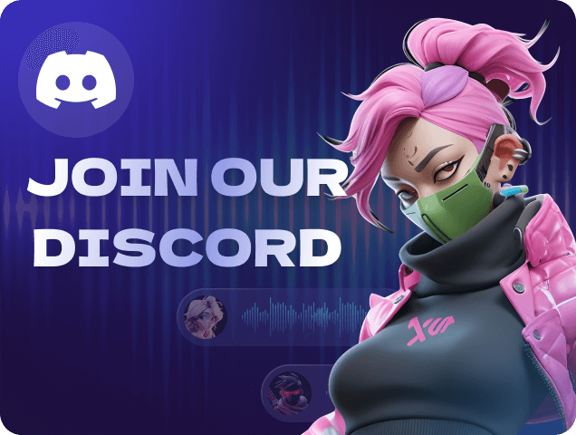
Use neon accents on dark backgrounds to mimic the "UI glow" trend. Discord’s dark theme pairs #5865F2 (neon blue) with #ED4245 (neon red) for vibrant yet readable buttons.
Contrast Techniques for Neon Design
- Use dark backgrounds to make neon colors appear even more luminous.
- Avoid using multiple neon hues together, as they may clash and create visual strain.
- Incorporate gradients to create smooth transitions between neon and neutral shades.
Final Words
Neon colors are more than just a trend—they’re a powerful tool for making unforgettable statements. Whether you’re designing a poster, revamping a brand, or creating digital art, understanding neon’s science and symbolism is key.
And with tools like HitPaw FotorPea, crafting eye-catching neon visuals has never been easier. Ready to light up your creativity? Dive into the neon revolution and let your designs shine.
 HitPaw Edimakor
 HitPaw VikPea (Video Enhancer)
 HitPaw Univd (Video Converter)


Share this article:
Select the product rating:
Daniel Walker
Editor-in-Chief
This post was written by Editor Daniel Walker whose passion lies in bridging the gap between cutting-edge technology and everyday creativity. The content he created inspires the audience to embrace digital tools confidently.
View all ArticlesLeave a Comment
Create your review for HitPaw articles