

Everything You Need to Know About Burnt Orange Color
Burnt orange is a rich, complex color that sits at the intersection of red, orange, and brown. Its name derives from its resemblance to the smoldering embers of a fire or the deep, autumnal tones of dried leaves. Unlike bright orange, which radiates energy and vibrancy, burnt orange is muted and grounded, infused with a dusky warmth that evokes nostalgia, earthiness, and sophistication.
In this article, we'll explore everything you need to know about burnt orange—from its meaning and color code to style inspiration and the best tool to create burnt orange images online.
Part 1. What is Burnt Orange?
Burnt orange is a deep, reddish-orange color that mimics the look of something gently scorched by fire. Unlike the brightness of a traditional orange, burnt orange has more brown and red undertones, making it more muted and sophisticated.
Unlike bright orange, it’s muted with brown undertones, giving it a vintage, grounded feel. This color’s unique blend of red and orange with brown undertones gives it a vintage, almost rustic quality, making it a staple in both retro and modern design palettes.

CTechnical Specifications
HEX Code: #CC5500
RGB Values: 204 (Red), 85 (Green), 0 (Blue)
CMYK Values: 0% Cyan, 58% Magenta, 100% Yellow, 20% Black
Pantone Reference: 17-1443 TCX (Burnt Orange)
Origins & Symbolism:
Historically linked to 1970s fashion and Southwestern aesthetics, burnt orange symbolizes:
- Warmth and Comfort: Its earthy tone evokes coziness.
- Creativity: A bold yet approachable hue for artistic expression.
- Resilience: Reflects the enduring beauty of nature’s cycles.
Part 2. Burnt Orange Color in Different Fields
1. Burnt Orange in Interior Design
In interior design, burnt orange adds warmth, depth, and energy to a space, making it feel inviting and cozy. This earthy tone works well in living rooms, dining areas, and bedrooms, often paired with neutrals like cream, beige, and gray to create a balanced and harmonious look.
Burnt orange can be used in accent pieces like throw pillows, rugs, or curtains, or even as a bold wall color to make a statement. It evokes feelings of autumn and nature, offering a grounding, rustic vibe while adding a pop of vibrant color. When used thoughtfully, burnt orange can transform a room into a welcoming, stylish retreat.
Style Ideas:
- Accent walls with burnt orange paint
- Burnt orange throw pillows and rugs
- Mid-century modern furniture in burnt orange upholstery
2. Burnt Orange in Fashion
In fashion, burnt orange is a versatile and bold color that adds warmth and vibrancy to any wardrobe. It evokes a sense of autumn with its rich, earthy undertones, making it perfect for fall collections.
This hue can be utilized for understated elements like scarves and shoes or for bold pieces like jackets, skirts, and accessories.Burnt orange pairs well with neutrals like black, beige, and white, as well as with deeper hues such as navy or olive green. It’s a color that exudes confidence and creativity, offering a sophisticated yet energetic vibe to both casual and formal outfits.
Style Ideas:
- Burnt orange knit sweaters or trench coats
- Dresses paired with gold or neutral accessories
- Men’s chinos or blazers in burnt orange for a smart-casual vibe
3. Burnt Orange in Branding and Web Design
Burnt orange is frequently used in branding and web design to evoke coziness, inventiveness, and vitality. Its earthy yet vibrant tone makes it an excellent choice for brands that want to appear approachable, confident, and dynamic. Burnt orange can evoke feelings of enthusiasm and innovation, making it ideal for companies in industries like food, lifestyle, technology, and health.
In web design, it works well as an accent color, drawing attention to call-to-action buttons or key sections without overwhelming the viewer. When paired with neutral colors like white, gray, or black, burnt orange stands out while maintaining a professional and stylish look.
Use Cases:
- Call-to-action buttons
- Logo designs for artisanal or handmade brands
- Background color for a cozy, retro-themed website
In conclusion, understanding the significance of burnt orange color in graphic design is the key to creating visually appealing and effective designs. Whether you are designing a logo, website or marketing materials, this warm and inviting color can help you connect with your audience in a meaningful way.
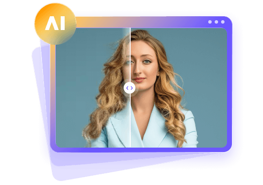
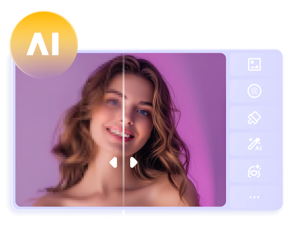
Part 3. The Best Tool to Customize Burnt Orange Images with HitPaw FotorPea
HitPaw FotorPea is by far the best way to customize the burnt orange images, allowing you to generate the burnt orange color images automatically. Apart from bringing in a simple user interface, HitPaw FotorPea ensures that you can generate multiple images simulataneosly. On top of that, HitPaw FotorPea also doesn't input the watermark on the generated images.
Whether you want to adjust colors, add burnt orange overlays, or create promotional visuals, it’s all doable in a few clicks. The speed at which HitPaw FotorPea tends to create the images is remarkable, and it also lets you export the generated images in their original image quality.
Features
- Allows you to generate the burnt orange images
- Supports Mac and Windows
- Generate the multiple burnt orange images simultaneously
- No watermark was detected in the generated burnt orange images
- Seamlessly enhance photo quality
- Colorize black and white photos
- Remove backgrounds or unwanted objects from photos without a trace
- Easily create ID photos


How to create the burnt orange color through HitPaw FotorPea?
Step 1: After launching the HitPaw FotorPea, you'll need to choose the AI Generator button.
Step 2: Select the Type What you want to see the button and input the text description about the burnt orange you want to generate.
Step 3: After selecting the resolution and styles, you'll need to tap on the Generate button to create the burnt orange color images. Next, you'll need to review the images and then choose the Download button to export the photos.
Part 4. FAQs of Burnt Orange
Q1. What colors go well with burnt orange?
A1. Burnt orange pairs beautifully with navy blue, olive green, mustard yellow, cream, white, and charcoal. These combinations add depth and balance.
Q2. What is the difference between burnt orange and terracotta?
A2. While both are warm earthy tones, burnt orange leans more toward orange and red hues, whereas terracotta has more brown and clay-like undertones.
Q3. What emotion does burnt orange evoke?
A3. Burnt orange evokes feelings of warmth, creativity, enthusiasm, and sometimes nostalgia. It’s bold yet comforting.
Final Words
Burnt orange is a dynamic color that brings richness and warmth to every context—from interiors and fashion to branding and visuals. This hue provides countless ideas for creating a logo, decorating a space, or staging a photo session.This article describes its features and adaptations in various fields, and also introduces you to an all-purpose color image generation tool.
HitPaw FotorPea is the ideal creative companion. With its easy-to-use features and smart AI enhancements, it makes editing and designing burnt orange visuals easier and more impactful than ever. Try it today and give your projects the burnt orange brilliance they deserve!
 HitPaw Edimakor
 HitPaw VikPea (Video Enhancer)
 HitPaw Univd (Video Converter)

Share this article:
Select the product rating:
Daniel Walker
Editor-in-Chief
This post was written by Editor Daniel Walker whose passion lies in bridging the gap between cutting-edge technology and everyday creativity. The content he created inspires the audience to embrace digital tools confidently.
View all ArticlesLeave a Comment
Create your review for HitPaw articles